FERNANDO DAZA monocromies-bicromies
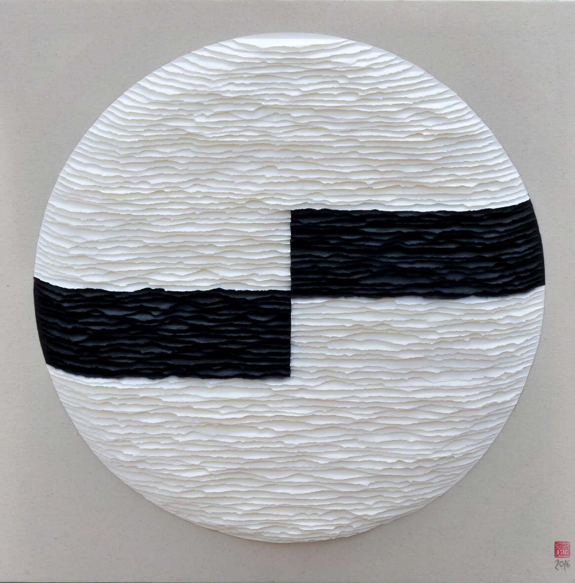
The artist uses manually torn paper in his creative process. Previously employing a monochromatic palette, he has recently combined two colors: one soft and one intense. This contrast results in a mixed-language work where the calm and subtlety of the light colors are punctuated by the vigor of stronger tones such as dark grays and blacks.
He also creates works by cutting paper with a craft knife, resulting in a more linear style since the cuts are straighter, but by no means lacking in beauty. The overlapping of forms, along with the shadows created by the separation of the different lines, leaves no viewer indifferent. The geometric and Cartesian structure, always present in his work, lends balance and order to his compositions.

a work that awakens the senses
positions.
A love of beauty and harmony is always evident in his creations. Some viewers may find his work reminiscent of Japanese art, but what Fernando Daza clearly demonstrates is an undeniable "savoir-faire," where works of great subtlety and beauty can be achieved by applying immense artistic creativity with just simple sheets of paper. Exhibition until May 12, 2016.